


After we had all the images together and selected the best ones we see ourselves using Sarah opened photoshop and set them out making small changes by putting the images into different orders and over the top of a digipak template, we then all disgussed what would look best so Sarah then rearranged them to see what fits best.

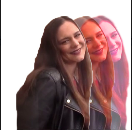
Sarah was good at photoshop as she studies photography and she started too manipulate a few images by overlaying layers and changing the opacity on the top layer but we all found what she was doing didn't fit the theme of the song and it didn't look the highest quality. The images was later discarded when Sarah played around and created better images, below is an example of one of the images that was discarded.


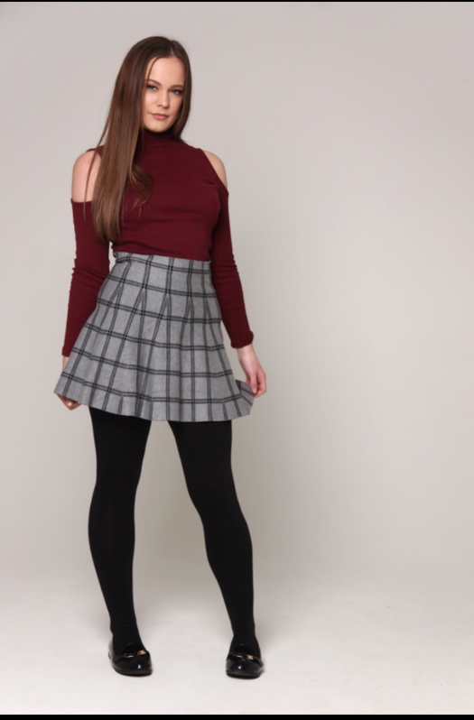


At this stage Sarah began to manipulate the individual images with mine and Louis's in put . She took some of the stages and applied them to all of the images, the standard stages started with Sarah cropping them to fit the dimensions of a digipak panel, removing the background as we had decided to use a plain white background so that all of the images matched.
Sarah used the crop tool in order to size the images to the right dimensions.


Sarah used the quick selection tool to select the background so that she could remove it from the subject in the foreground. One the whole background was selected she used the eraser tool to erase the background and then inserted a white background so all of the images matched.

Sarah then had to crop the images down again to the right size on the white background so that they would fit the dimensions of the panel of a digipak. Once all the images were a equal size and all matching with the white background she started creating the colourful overlay images that we all planned to use for our two inside panels and back panel.

This started with Sarah using the quick selection tool again to select the subject in the foreground. She then copied the layer three times moving each over a tiny bit at a time, In the side bar Sarah selected the opacity and turned it down more and more for each layer with the layer on top being most opaque. She then used the hue and saturation mask tool in the side bar and changed the hue for the bottom two layers, The back layer was changed to a purple hue, the second had changed to a green hue and the top layer was kept normal in this image.

Fir the other image the same steps were taken. Although in this image we wanted to have a different colour scheme we all agreed that we thought more of a red tone however we was unsure which so Sarah played around with some different colour schemes to see what would look the most ideal. Below are the four examples of the colour schemes we was looking at;


As a team we all sat down and looked at all of the images in detail to see which we liked best, it took some time for us to agree on what was best and we had some detailed discussions over the images as we compares the positives to the negatives of each image and the colour schemes.

In the end we all decided on the red pink toned one that was at the lower opacities in the back two layers. We chose this one as it was more red toned however it wasn't too overpowering, it also fit best with the other already edited image. Below is our chosen image.

The third overlay image, the one for the back panel we wanted to take the two previous edited overlay images and place them back to back showing the transformation from unpopular to popular showing how drastically her appearance changed. Sarah adjusted the size a little for each of the two images and also used the quick selection tool again to select a selection of my shoulder in the red image to remove it as it was overpowering the back image of the purple and green image.

This is the final combined back panel images.

When we was at this stage of process Sarah started placing images into the digipak template and started adding all the finishing touches. We decided as a group Sarah should add some text we decided to have some quotes from the lyrics in the song. We decided to use the same font as we did on the advert to make it match. Sarah dropped the opacity on the text due to the overlay effect we decided this would look best to make the text fit with the image in the background best.


The Digipak was starting to look like this.

we then went in flipping all the images at the top over and text due to it being a digipak.

Below is now our completed digipak

No comments:
Post a Comment